Monday, 6 April 2020

So How's That Working For Ya?


In our battle against the Corona-virus, we are pinning a lot of our hopes on one strategy;

Social Distancing

We are hoping this will flatten the curve.  But will it?

Is it?

Well, if we look at some provincial data, cumulative cases per million population, the answer is - not yet!  The chart below shows three provinces; Quebec (poor old Quebec - off the charts!), Ontario and Alberta.

Ontario and Alberta are still on the upward trajectory - I won't use the word exponential increase.  Although I think I certainly would be justified if I did.

[As always, click the graphs to zoom in.]


So why am I showing this?

Well, one province was a early adapter of social distancing practices.

British Columbia.

So lets add B.C. to the above graph and see what that gives us;


The orange B.C. line has an interesting shape.

It's still early, but their graph looks to be turning the corner a little.  Whereas Alberta and Ontario's line, beside it, just keep on heading up.

I don't say this very often, but way to go, you flakeheads out in La La Land!


Okay, so let's see if today's stats show any indication that social distancing is working.


Ouch.  No.

With almost a thousand new cases in, yup you guessed it, Quebec.

Although no new cases reported in B.C.  Hmmmm.....


And now a look at the ghoul pool, as they used to call the betting on the annual number of murders in Detroit back in the 70's.....


Still sizable increases, with deaths split almost evenly between Ontario and Quebec (and none in BC).

So keep on....doing nothing.

I want leave you with some comforting words from the British government, courtesy of the BBC....


Cheers, mates.


Sunday, 5 April 2020

The Hits Just Keep On Coming


Using the same chart format comparing cases & deaths per million population, not surprisingly, Quebec is having the toughest time of it.

[As always, click the graphs to zoom in.]


But to provide some perspective on the mortality rate, at least, here are some notables, in deaths per million population:

  • USA                       25  (as context, Quebec is at 7)
  • Canada                    5
  • New York              182
  • New York City       304   !!
  • Italy                     254
  • Spain                    251
  • France                  116
  • Iran                        41
  • Sweden                  37   (experimenting with no social distancing)
  • South Korea            3
  • China                      2   (what's up with that?)

On to yesterday's Canadian stats......

New Cases


Almost 900 new cases in Quebec and almost 400 in Ontario.

For the mortality picture.....


Large numbers of deaths in Ontario continue (27), with a lot in long term case homes.

The trend charts look like we are essentially treading water. Which could be a lot worse.


So I don't often share pictures of myself, but in these uncertain times, I'll make an exception. Considering how this is taking a toll on all of us....


Saturday, 4 April 2020

Us And Them (Although It's Really All Us)


Interesting comparison between the US and Canada in the trend of new COVID-19 cases.

Back in the beginning of March [Wow, seems a lot longer ago than one month when things were still relatively normal] the US & Canadian # of cases (per million population) were the same.

In fact, the Canadian rate was slightly higher until March 9th.

After that the US rate really took off!

[As always, click the graphs to zoom in.]


Why the difference?  Why did the US rate take off like that?

Dunno.

In fact, the US had slapped travel bans on China, Iran, South Korea and Europe well before Canada.

And were quarantining returning travelers at military bases.

When I returned, all I got was, "You know you have to self quarantine for two weeks, right?"

The difference in death rates is even more dramatic.


Most of that is probably driven by New York.

But I don't think we should get too smug.  It may only be a matter of timing.

If I shift the Canadian "Cases" graph back just over a week, the trends look disturbingly similar.


Our actions over the next two weeks could decide the shape of our graph.


On to yesterday's Canadian stats......

New case increases attenuating a little.


Deaths, however, continue, seemingly unabated.  [Ed. Note: Attenuating? Unabated? Have you been listening to too much CNN?]


Large increases in Quebec (25) and Ontario (14).

A large portion of the Ontario increase, as previously discussed, has occurred at long term care homes.

That devastated rural Ontario nursing has now lost 20 of their 65 residents.

So stay home.

On the plus side, I am saving a lot on soap and shaving cream.

Friday, 3 April 2020

April 2nd COVID-19 Stats


Things not going in the right direction.

Unless you are some twisted, sick, bad ass.  [If I can find it, I'll post a bit from a Finnish comedian trying to understand what the word "ass" really means in English. Besides, you know, yer bum.]

New cases in Canada took a jump yesterday.

[As always, click the graphs to zoom in.]


Led by Quebec & Ontario.

Lets go to the provincial rates (per million population)


Of course, that population is dropping by the day.


With 16 of those deaths in Ontario, as many more long term care home residents succumb.


Silver (or Black) Lining?
About the only bright note for Canada is that crude prices rebounded big time yesterday.

The largest percentage gain.....ever.

And for Western Canadian Select, the price has more than doubled from last week.

Still under ten bucks a barrel, but better than a cheap cuppa joe.


And one other bright spot......


Thursday, 2 April 2020

240,000 Deaths!?


That's what the latest models are saying for the likely number of US deaths due to the Coronavirus!


What the.....?

How they hey did they come up with that number?

Well, I don't think you need any fancy modeling, just a few assumptions. And here they are:
  1. assume COVID-19 death rate same as regular flu:         0.1%
  2. assume percentage of Americans eventually infected @ 75% (nobody has immunity)
  3. US population:  330,000,000
Now, do the math:

          Deaths = 330,000,000  x  0,001  x  0.75  = 247,500

Do you feel lucky punk?  Well do ya?

Now some of you may say, Hey, UC, the death rate is closer to 1%, not 0.1%.   And if that is true, that's when you get the US death toll up to two and a million.  Whoo boy!


So back to Canada....


New cases holding steady.

But we all know that's because those lazy ass bastards in Ontario have taken the Urban One's advice and stopped testing!

Okay, maybe not.

Deaths (below) don't lie, though.


Interesting statistic from yesterday, of Ontario's 37 Coronavirus deaths, 30 of them have been in long term care homes.

The lesson from that? Don't get old!

Oh oh - too late!


Wednesday, 1 April 2020

End of the First Quarter


New cases still high, but maybe that is a good sign - if testing has also increased.

[As always, click the graphs to zoom in.]

732 new cases in Quebec and 260 in Ontario.


And new deaths are lower after that awful day from the rural Ontario retirement home.


All but one of the new deaths in Quebec, the other being Alberta.

I criticized Ontario yesterday for doing such little testing.  But maybe that's the way to go.

Less testing, less new cases!

In fact, do no testing.  I've solved the problem!


Tuesday, 31 March 2020

Too Smug....?


Number of cases of COVID-19 exploded [Ed. Note: Who are you - the Toronto Star?] in Canada yesterday.

[As always, click the graphs to zoom in.]


And more unfortunately, deaths even more so.


One rural Ontario retirement home had nine residents die.

And of the 65 residents, 35 are infected and more than a third of the home's staff, 24, tested positive, with 10 more results pending.  Heartbreaking.

Update: three more seniors died this morning.


So....Too Smug?
I have been wagging my finger at some provinces with high infection rates.  Don't they get it?  Don't they get how serious this is?

It's the usual "bad actors": Quebec, BC, Alberta.


However, in my defense, I had also been saying Ontario's numbers might be somewhat low, as it was trying to clear a backlog of un-analyzed tests.  And Ontario also has had a low testing rate. Could those be contributing to Ontario's perceived low infection rate.

Well, that is the biggest understatement made!  Here is a graph of testing rates per million population;


Ontario sits dead last!  Disgraceful.

No idea we were that low!

And some of the perceived biggest offenders are the largest testers (Quebec, BC & Alberta).

So maybe these bad actors do get it.  They are taking it seriously.

Well past time for Ontari-ari-ari-io to get with it as well.

If they do, get ready to see a big move up the infected leaderboard.


Monday, 30 March 2020

COVID-19 March 29


869 new Canadian cases on March 29th.  Mainly in Ontario (362) and Quebec (342).

Likely (hopefully) the result of clearing some of the testing backlog.  Time will tell....

[As always, click the graphs to zoom in.]


 And here is how the provinces are faring.  Not much of a change from yesterday.


Except Canada's rate increased from 144  cases per million population to 168.

Other countries:
  • Spain 1,822
  • Italy   1,616
  • USA     431  (New York: 3,068!)

The impact on Canada?
The fact that everybody is "staying home" is having a major impact on world crude prices.  That and the Saudi/Russian price war.

The benchmark WTI (West Texas Intermediate) Crude is at $20/barrel.  In January it was $60!

What's worse for Canada - as our economy is so dependent on revenue from the oil and gas sector, whether you like it or not -  is the price of Canadian crude.

Unbelievably, Western Canadian Select is now selling for $6 a barrel! 

$6!!


That's less than a frickin' cup of coffee at Starbucks!!


This may not end well for the Canadian economy.

What's the expression: the cure may kill the patient...


Sunday, 29 March 2020

Okay Class


For today's lesson, we will drill down into what the hey is going on with our neighbours to the south, in the good old US of A.

Even though the US is in relatively good shape compared to the rest of the world....

[As always, click the graphs to zoom in.]


[There it is in the, relatively good, lower left part of the graph.]

....when you drill down into the state by state details, some big differences appear.


No surprise that New York is leading the US virus parade.  By a long way.

Which countries could be compared?

Well, Italy & Spain are well off the charts to to upper right (the not good section).

But New York is doing worse than both Switzerland and Iran (added below in red).


I guess New Yorkers don't take kindly being told what to do, to practice "social distancing".

Of course, things have been moving very quickly recently, when less than three weeks ago, during a March 11th press conference, New York's mayor, Bill de Blasio, told people to not avoid restaurants, not avoid normal things that people do.  "If you’re not sick, you should be going about your life.” 

But things changed quickly. Three days later he closed their schools and then the bars and restaurants.  But maybe by then that old horse had left the barn.   Dunno. 

And, of course, New Orleans didn't cancel Mardi Gras, so Louisiana is paying the price. 

Anyway, here are yesterday's Canadian stats....


Are new cases leveling out? too soon to tell.

Could be just slower testing.

But at least a lot better than many places in the world.

And if you are in Ontario - even with all the freaking out lately - we are in a lot better shape than most of the provinces.....

[The red line is the Canadian average of 144.]


Saturday, 28 March 2020

Some More Perspective


Not to downplay the seriousness of the Canadian COVID-19 situation,but if we look around the world, many, many countries are in more serious situations than we are.

Previously I showed a chart of per capita cases; cases per 100,000 of population.

[As always, click the graphs to zoom in.]


Canada is fairly far down the list. Although things change quickly.

So I'm here adding an additional view.  If number of cases shows the breadth or depth of the contagion, deaths would show the seriousness of it.

So here are a couple of graphs showing "Cases per million population" on the vertical axis and "Deaths per million population" on the horizontal axis.


As suspected, poor old Italy & Spain are in the upper right hand corner; high cases, high mortality rate.

Little San Marino, a tiny little enclave within - you guessed it -Italy, is the worst in the world, off the chart. So is tiny Iceland (upper left); a lot of cases, not so many deaths....so far.

For all we hear of the US and China, they are relative pikers in all this.  Way down in the lower left corner.

Where is the Great White North?


Canada is also tucked way down the in the lower left corner.

Let's drill down into that corner.  I guess you could call that the good corner,,,,,at least for now.


Even when you drill right down into the "good corner" we are in pretty good shape.  By the way, I guess I should end every sentence with.....so far.

Is the rest of the world freaking out as much as we are?

I don't know.  But we are certainly not alone in all this.

So on to today's stats.  Well, yesterday', really.


It looks like the rate of increase of cases has slowed, just a little.

That's good news, but two factors tell me this is just temporary;

  1. In Ontario, at least, there is a backlog of over 10,000 tests waiting for results.  If 3% come back positive (about the going rate of positive test results) that is another 300 alone in Ontario.
  2. Again, in Ontario at least, they are going to double the number of tests within a week, from ~2,500/day to 5,000.  That will certainly increase the number of positive cases.  The good news is, getting a better handle on who is infected can only help.


Okay, so much for doom and gloom, on to today's joke.

There is no joke.  That's the joke!


[Ed. Note: You seem to have a lot of time on your hands.  You think you'd be able to come up with one damn joke!]


Friday, 27 March 2020

Not So Fast


Although it looks like the number of Canada's new COVID-19 cases have dropped, it is only because yesterday's numbers were inflated by 800 Quebec "Probable" cases becoming 800 "Confirmed".

So if you ignore yesterday's number of ~1,400, still a large increase form the previous day.

[As always, click the graph to zoom in.]


Now I guess they are trying to sell newspapers or whatever, but interesting that the media always call it a spike in new cases, or a surge, or deaths have skyrocketed.

Always with the hyperbole.

I am outraged and incensed when they do this!!

Just give me the data and let me decide on which adjective to use.

Thursday, 26 March 2020

Some Perspective


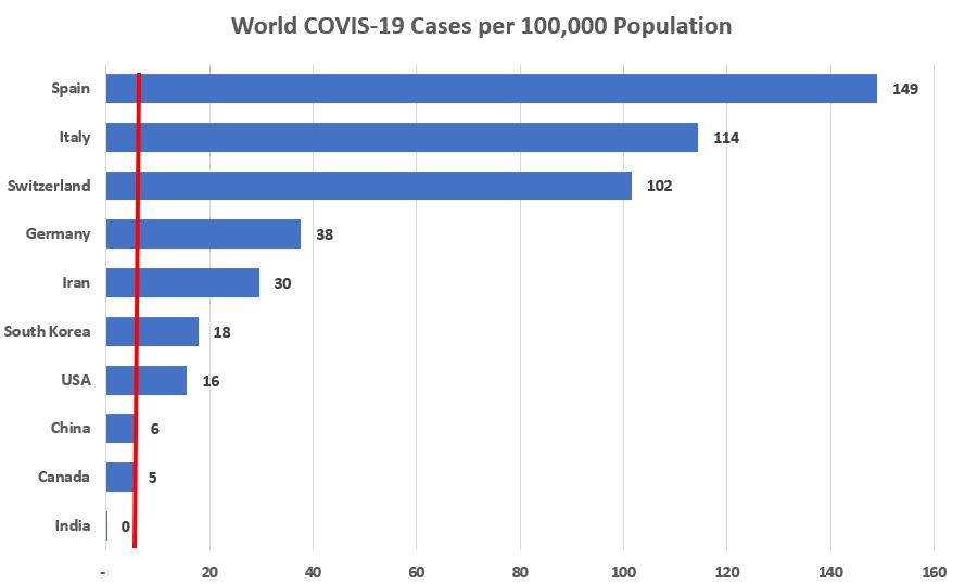
It is still early in Canada's fight against this invisible foe, but let's look at data from around the world.

For comparison purposes, I'll look at it on a per Capita basis;  cases per 100,000 of population.

The world average is 5;  415,000 cases worldwide on a population of 7.8 billion souls.

Canada's average is also 5.   [Again, click any graph to zoom in.]


But sweet mother, poor Spain and Italy.

And Switzerland?  What's up with that. Apparently, there had been unknown cases at a ski chalet and the country was very slow to pick up on this.  And when people went home - and not just home in Switzerland - they took it with them.

Of course, for the world average to be 5, there has to be many, many, many countries less than this.  So far, at least.....

If we drill down into Canada.....


Ontario don't look half bad....so far....

So here are today's stats.


And, as predicted, our friends in Quebec did it to us this time.

Those ~800 "Probable" Quebec cases shown in yesterday's post have, now come home to roost - they all reflected in today's "Confirmed" numbers.

So...updating the above provincial numbers with the Quebec additions.....


...puts Quebec at the top of the heap for number of cases.  And doubles Canada's per captia rate.

As widespread testing continues to increase, I suspect we will see these numbers continue to increase as well, before we can even hope for a turnaround.....

Wednesday, 25 March 2020

Grocery Shopping in Florida During the Pandemic


We interrupt our usual doom and gloom reporting of all things Corona-virus with an information item from the Sunshine State.

Our regular dour programming will resume tomorrow....


I'm Not So Sure.....


Something fishy with today's WHO (World Health Organization) stats.  These are significantly lower than the Government of Canada stats.

On which the WHO reports are supposedly based.

So here is the WHO report.

Can't believe the # of new cases is so low.  In fact, don't believe it.


And here is the graph based on Government of Canada data.

And it is not due to just a day's lag in reporting.

Looks a little more reasonable.  Unfortunately.


The big Matzo ball out there, however - and not included in these numbers - is that Quebec has almost 800 "probable" cases.

Which, if confirmed, would quadruple their number of cases.  Quadruple, I tell you!!

Mon Dieu!


Tuesday, 24 March 2020

Up, Up And Away


Another large increase in positive COVID-19 cases in Canada.


Although on a slightly more encouraging note, although we now have over 1,400 positive cases, that is out of 103,000 people tested.  That works out to a 1.4% infection rate.

And even better, that is only 1.4% of people tested, people who are deemed to beat risk, people who are suspected of having the virus or exhibiting symptoms.

That being said, there is likely a huge backlog of required testing.

So....stay tuned......

Monday, 23 March 2020

I'm Back, Baby!


But only as a public service.....

Not to be a purveyor of more doom and gloom, when around us is all doom & gloom, but publishing this as a way to watch us turn the corner on this invisible foe, this COVID-19.

This graph - based on the daily Situation Reports from the World Health Organization - documents the number of new COVID-19 cases in Canada (blue bars) and the total number of cases (orange bars).

As you can see, the orange bars are "off the charts", but it is only the new cases I am interested in.

The new cases will, unfortunately, continue to rise.  But, at some point, they will start to decline.

And if the Chinese are any example, they will eventually drop to zero.

So stay turned as we straddle this bumpy ride together.

[Double click the graph to get a better view.]